Building a React Component Library from Scratch
You're probably wondering, why would you build a component library from scratch when there are so many great ones out there? I'm glad you asked! I built this library for a few reasons:
- I needed full control over the components I was using in my application. I wanted to be able to customize the components to my needs and not have to worry about breaking changes in the future.
- Not all libraries are created equal. Some libraries come with some really great features, but some don't come with everything you need. I wanted to build a library that was lightweight and had all the features I needed.
The Tech Stack
I decided to build this library using the following technologies:
- React: most of the custom software I build is based in React.
- Typescript: type-safety and autocomplete intellisense with most modern IDE's.
- Tailwind: utility-first CSS framework made it a perfect choice for building custom components.
Typescript - Why use it?
Type safety is a huge benefit of using Typescript. It allows you to catch errors at compile time instead of runtime. This is especially helpful when building a component library because you want to make sure that the components you build are flexible enough to be used in a variety of different ways.
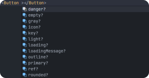
Every component has an interface that defines the props that are required and the props that are optional. This allows you to see what props are available and what they do. This is especially helpful when you're using a component library in a project that has a lot of developers working on it. Not everyone is going to be familiar with the library, so having a clear interface for each component is a must.
interface ButtonProps {
  primary?: boolean
  secondary?: boolean
  danger?: boolean
  success?: boolean
  outline?: boolean
  gray?: boolean
  light?: boolean
  empty?: boolean
  rounded?: boolean
  small?: boolean
  icon?: any
  loading?: boolean
  loadingMessage?: string
}
The interface above is an example snippet from the component library. It shows all the props that are available for the Button component. VS Code will provide autocomplete intellisense for each prop, you can see what type of value each prop expects, and if it's required or optional.